Color · 7 min read
Dining Room Paint Colors: Choosing for Candlelight, Chandeliers and Wainscoting
Dining rooms are often used in the evening, which changes the rules. Pick the color for the candles and the chandelier, then check that it still works at noon.
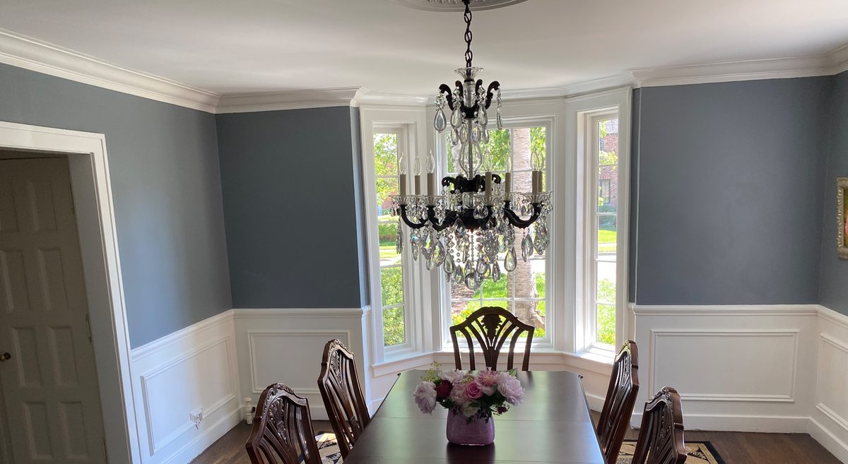
A dining room is often used in the evening, so choose its color for candlelight and chandelier light, not for noon. Deeper colors such as Pewter Green SW 6208, Naval SW 6244 and Rookwood Red SW 2802 can look rich in that light, and soft off-whites still work. Test large samples in the evening with your bulbs on.
Key takeaways
- Judge a dining room color in the evening with your actual bulbs on, because that is when the room is often used.
- Deeper colors such as Pewter Green, Naval and Rookwood Red suit dining rooms well, but they need careful prep and often extra coats.
- Wainscoting and trim set the contrast, so decide on them before the wall color above.
- Eggshell or matte suits most dining room walls, satin or semi-gloss suits trim and wainscoting, and a light flat ceiling keeps deep walls from feeling heavy.
Sherwin-Williams colors in this guide
Jump to a section
- Why is a dining room different from other rooms?
- Which deeper colors work in a dining room?
- What if I prefer a lighter color, or my furniture is dark?
- How do wainscoting and trim change the color choice?
- How do I test a dining room color?
- What sheen and ceiling color work in a dining room?
- Why do deep dining room colors take extra care?
- When should I paint a dining room before holiday hosting?
- Questions
Why is a dining room different from other rooms?
Most rooms are judged in daylight. A dining room often isn’t. Dinner tends to bring warm bulbs, dimmers and candles, and a color that looks cheerful at lunch can go muddy or flat at 7 p.m.
The room is also often closed in, with fewer windows than a living room and a table in the middle. That makes it a good place to try a color you would hesitate to use in a big, bright space. Deeper walls can make a dining room feel intimate and wrap the table in color. In a small room a deep color may feel snug rather than cramped, though that is a matter of taste, so test it on more than one wall before you commit. Many traditional houses have a separate dining room, and some have wainscoting or paneling, so this is a room where trim and wall color have to be decided together.
Which deeper colors work in a dining room?
Several Sherwin-Williams colors suit evening-use rooms:
- Pewter Green SW 6208, a deep, moody green-gray that is calm rather than loud and looks handsome with wood furniture.
- Evergreen Fog SW 9130, a gray-green sage that is softer than Pewter Green, a good choice if you want depth without drama.
- Naval SW 6244, a deep navy that contrasts crisply with white trim; test it under your actual bulbs, since dark colors shift with them.
- Rookwood Red SW 2802, a deep historic red (oxblood), for a dining room that wants real drama.
- Rookwood Dark Green SW 2816, a dark traditional green that suits a period room with stained woodwork.
- Urbane Bronze SW 7048, a warm bronze-brown dark neutral if you want depth without a strong color.
For choosing and painting any of these, see our deeper guide to dark and moody interior paint colors.
What if I prefer a lighter color, or my furniture is dark?
A dining room does not have to be dark. Shoji White SW 7042 is a soft off-white with a greige cast, and Creamy SW 7012 is a true cream with visible yellow warmth, which may read even yellower under warm bulbs, so test it first. Sea Salt SW 6204, a pale green-gray that can read soft blue or green depending on light, is a quiet option. Lighter colors suit a room where you want the extra reflected light, or where dark, heavy furniture should stand out as the feature.
A dining table, chairs and a sideboard are large, dark shapes against the wall. Dark stained furniture can melt into a deep wall, which some owners love for its richness and others find heavy. Artwork and mirrors read differently against each: gilt frames glow against deep green or navy, and framed prints look crisp on a soft off-white.
It is also worth thinking about how the room connects to its neighbors. If the dining room opens to a hall or living room through a wide doorway, you see both colors at once, and they should look intentional together rather than accidental. Standing in the doorway with a sample board is a simple check. If you aren’t sure where to start, our guide to interior colors for older homes compares neutrals and softer colors for plaster rooms.
How do wainscoting and trim change the color choice?
Wainscoting, chair rails and picture rails split a wall into zones, and the colors you pick for those zones determine the contrast. There are three common approaches:
- Traditional contrast: white wainscoting below, a deeper color above. A clean white such as Pure White SW 7005, or the brighter, slightly cooler Extra White SW 7006, sets off the wall color clearly.
- Tone-on-tone: the same color on wainscoting and wall, perhaps with a different sheen. This feels moody and enveloping.
- Reverse: a deep color on the paneling below and a lighter one above, which grounds the room.
Raised panel wainscoting has plenty of edges and corners where paint pools or leaves a rough line. A careful painter checks these: panel edges are sanded smooth, the caulk is neat and there is no drip in the inside corners. Paneling is usually painted from the inside out, with the panel moldings and fields first, then the rails and stiles. Our guide to painting decorative woodwork and paneling covers the details.
Painting rooms like this in Grosse Pointe?
Tell us about your home and we’ll be in touch to talk it through.
How do I test a dining room color?
Start with large samples on two walls, ideally one near the window and one on the far side of the table. Then look at them three times: in morning light, at midday, and at night with the chandelier or sconces on. If you use a dimmer, test at your dinner setting, not at full brightness.
Bulb color matters. Warm bulbs around 2700K push deeper greens and navies toward warmth, while cooler bulbs push them toward blue and gray. For more, see how bulbs and lighting change paint color. Screens and printed chips mislead badly with dark colors, so rely on the real sample.
A few extra checks are specific to dining rooms:
- Look at the sample while seated at the table, because that is the view your guests will have.
- Hold the sample beside the sideboard, curtains and any art you plan to keep.
- Check it with candles lit and the overhead light dimmed, not only with the switch on full.
What sheen and ceiling color work in a dining room?
Dining rooms see less wear than kitchens or hallways, so eggshell or matte works on most walls. Plaster walls are common in older Grosse Pointe and Metro Detroit homes, and dark colors at higher sheens show every wave in plaster and every roller mark, so go lower if your walls are uneven.
If there is a chair rail, the section below it can carry a more washable sheen such as satin, since chair backs bump the wall, while the wall above stays matte or eggshell. With no chair rail, keep one sheen across each wall, because a patch in a different sheen looks like a different color. Trim and wainscoting in satin or semi-gloss wipe clean. Our paint sheen guide explains the trade-offs.
A white or very light flat ceiling keeps the room from feeling heavy, even with deep walls. Some owners take the wall color onto the ceiling for a cocoon effect, but that suits rooms with an even ceiling and good light, because a dark ceiling shows every patch and stain. The usual order of work is ceiling first, walls next, trim last. Our ceilings guide has the details.
Why do deep dining room colors take extra care?
Deeper colors are less forgiving, and the extra attention shows up in the details:
- A major color change, or a dark or red color, may need a tinted primer and extra coats. Check the label for guidance.
- Patches and repairs have to be primed, because unprimed spots show as dull, uneven patches in dark colors.
- Cutting in at the ceiling and trim needs a steady brush and a wet edge to avoid lap marks.
- Plaster walls are checked in raking light for waves before painting, so you know what the finish will reveal.
- Hardwood floors are protected thoroughly, since a dark drip is hard to clean off a finished floor.
This lines up with our process: floors and furniture protected, surfaces cleaned, loose paint scraped, edges sanded, holes and cracks filled, joints caulked, bare areas primed and even coats of Sherwin-Williams paint, with Bob and Bobby on every project. A final walkthrough with touch-ups finishes the job.
If the house was built before 1978
Whoever does the work, homes built before 1978 may contain lead-based paint, and scraping, sanding or scuffing old paint on wainscoting, trim or plaster can create hazardous dust. Don’t dry-scrape or dry-sand paint that hasn’t been tested. Cleanup matters too: the usual advice is to wet-wipe surfaces and use a HEPA-filter vacuum, not dry sweeping or an ordinary household vacuum, which can blow fine dust back into the air. The EPA’s Renovation, Repair and Painting (RRP) rule requires any firm paid to do that work in a pre-1978 home to be certified and to use lead-safe practices, generally when more than 6 square feet of painted surface per room inside is disturbed; see the EPA’s Renovation, Repair and Painting program page. Older plaster and joint compound can also contain asbestos, so have suspect material tested before sanding or scraping it. If a test is positive, leave the material undisturbed and ask a qualified asbestos professional whether it should be left alone, sealed (encapsulated) or removed. Don’t scrape, sand, roll or spray it yourself.
When should I paint a dining room before holiday hosting?
Timing matters in a Michigan winter, when holiday hosting is often the deadline. Plan to finish well ahead of the first dinner. Paint may feel dry within hours, but it keeps hardening for weeks, so be gentle with the walls and trim at first.
The room also needs to stay within the temperature range printed on the label while the paint dries. Keep the heat on and ventilate briefly rather than leaving windows open for hours.
If you are planning the whole room, see our interior painting page, and the living room colors guide if the rooms open to one another.
Questions
What color should I paint a dining room that is used mostly in the evening?
Deeper colors like Pewter Green SW 6208, Naval SW 6244 and Rookwood Red SW 2802 can look rich under candlelight and warm bulbs. Softer options such as Shoji White SW 7042 or Creamy SW 7012 can work too, though a cream may read yellower under warm bulbs. Test large samples at night with the real bulbs on.
Can I use a dark color in a small dining room?
It can work. Many people find that dark walls make a small dining room feel intimate rather than cramped, though that is a matter of taste and not a rule. A white or very light flat ceiling and white or contrasting trim help keep it from feeling heavy. Test the sample on more than one wall.
How should I pair trim with a colored dining room?
Clean whites such as Pure White SW 7005 or Extra White SW 7006 give clear contrast against deep walls, while warmer whites feel softer. Test the trim white right next to the wall color, because a white can look yellow or gray beside it.
About the author
Guiffre's Painting Co.
Family-owned interior painting and plaster repair serving Grosse Pointe and Metro Detroit. Owner Bob Guiffre has been painting for more than 37 years — more than 1,800 homes — and his son, Bobby, works beside him on every project. We paint with Sherwin-Williams. Estimates are free. Insured: $1,000,000 general liability. Call (586) 722-3277.