Color · 7 min read
Interior Paint Colors for Older Homes: What Suits Plaster, Woodwork and Wavy Walls
Older houses have gently wavy plaster, deep window casings and woodwork with its own color. The right wall color works with all of that instead of fighting it.
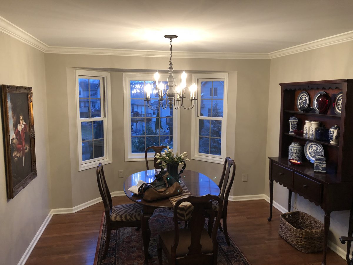
For most older homes, start with warm, slightly muted colors: soft whites, creamy off-whites, greige, gentle sage and soft blue-gray. They sit naturally beside plaster and aged wood, and they are forgiving of the gentle waves older walls often have. Then test every candidate on your own walls, because screens and paint chips mislead.
Key takeaways
- Warm, softly muted colors usually flatter plaster walls and original woodwork better than stark, cool shades.
- Decide what happens to the woodwork first, because its color sets the undertone every wall color has to live with.
- Sample on at least two walls of the actual room and look at them in morning, midday and evening light.
- Use flat or matte on wavy plaster and keep the sheen the same across a whole wall, because glossy finishes exaggerate every ripple.
Sherwin-Williams colors in this guide
Jump to a section
- What makes an older home different from a new one?
- Should I decide on the woodwork before the wall color?
- What colors look good in an older home?
- How does the light in an older house change the color?
- How do I test an interior paint color the right way?
- Does the finish matter as much as the color on plaster?
- Why does prep affect how a color looks?
- How do I choose colors that work from room to room?
- Questions
What makes an older home different from a new one?
New drywall is flat and uniform. Plaster is not. It has gentle waves, trowel marks and corners that are not always razor-straight. Older rooms also tend to have woodwork that has darkened, yellowed or been painted many times, plus details such as picture rails, deep window casings or crown molding. Where the surface has cracks or loose spots, plaster repair belongs ahead of color.
All of that changes how color behaves. Glossy finishes show every wave and patch, and a stark, very bright white can do the same in side light. Muted colors with some depth tend to be more forgiving, and they sit comfortably beside trim that has its own warmth. In and around Grosse Pointe, plaster walls and original wood trim are common in the early-to-mid 20th century Colonial Revival, Tudor Revival and French-style houses, so a wall color there has to get along with a lot of wood.
Should I decide on the woodwork before the wall color?
Yes. Woodwork is the largest fixed color in many older rooms: a stained oak staircase, a dark mantel, painted white casings that have yellowed with age. Whatever you choose for the walls has to get along with it.
Stained wood you plan to keep tends to suit warmer, softer wall colors that echo its undertone without matching it exactly. Painted trim gives you more freedom. A clean white such as Pure White SW 7005, or the brighter, slightly cooler Extra White SW 7006, frames a wall color crisply, while a warmer off-white such as Alabaster SW 7008 or Greek Villa SW 7551 feels gentler beside creamy plaster tones. Our guide to whites for interior walls and trim goes through those choices in more detail.
If the woodwork is a different era than the walls, or half of it has been painted and half hasn’t, settle that question first. Changing the trim color later means redoing the cut line along every wall you just finished.
What colors look good in an older home?
Neutrals are the safest and most flexible starting point. The three most often compared are Agreeable Gray SW 7029 (a light warm gray that reads as greige), Accessible Beige SW 7036 (a warm greige that leans more beige) and Repose Gray SW 7015 (a light gray that reads cooler and can lean slightly blue or violet in cool light). We compare them side by side in Agreeable Gray vs Repose Gray vs Accessible Beige.
For softer, more traditional whites, Shoji White SW 7042 is a soft off-white with a greige cast, deeper than Alabaster, which helps when you want a light room without the starkness of a pure white. Creamy SW 7012 is a true cream with visible yellow warmth, a good fit for a room meant to feel sunny and traditional. Because it is noticeably warm, test it carefully next to your trim.
If you want more color than a neutral, older homes take it well when it is muted rather than loud. A few that tend to suit them:
- Sea Salt SW 6204, a pale green-gray that can read soft blue or green depending on light, for bedrooms, baths and quiet rooms.
- Clary Sage SW 6178, a soft, muted sage green that sits comfortably beside natural wood.
- Evergreen Fog SW 9130, a gray-green sage with more depth for studies and dining rooms.
- Restrained Gold SW 6129, a muted, earthy gold that suits a hallway or a room with a lot of dark wood.
- Naval SW 6244, a deep navy for a dining room or library that has good light and strong trim.
For darker rooms and how to paint them well, see our guide on dark and moody interior paint colors.
How does the light in an older house change the color?
Older rooms can have smaller windows, deep casings and mature trees outside, and a mix of orientations makes one house read very differently from room to room. As a rule, north-facing rooms look cooler and grayer, south-facing rooms look warm and bright, east light is warm in the morning and cooler later, and west light turns warm late in the day.
Trees change the picture through the year. Leaves filter summer light, and bare branches let more of it in during a Michigan winter, so a color you chose in July can read differently in January.
Bulb color matters as much as windows: a warm bulb around 2700K pulls colors toward yellow, while cooler daylight-style bulbs pull them toward blue. Our guide to how light direction changes interior paint color explains how to plan for each room.
Painting rooms like this in Grosse Pointe?
Tell us about your home and we’ll be in touch to talk it through.
How do I test an interior paint color the right way?
Skip the tiny chip and the screen. Testing a color well comes down to a handful of habits:
- Paint a large sample, roughly two feet square, on at least two different walls in the room, ideally one that gets direct light and one that stays in shadow.
- Leave a white border around the sample so the old wall color doesn’t skew what you see.
- Look at it in the morning, at midday and in the evening with the lights on.
- Check it next to the actual trim, floor and furniture, not in isolation.
- Live with it for a couple of days before deciding.
On old, dark or patterned walls, a sample painted directly on the wall can mislead, because the color underneath shows through a thin sample. Two coats on a primed board that you move from wall to wall often tells the truth more reliably. The full approach is in our guide on how to test paint samples at home.
Does the finish matter as much as the color on plaster?
It does. Sheen can undo a good color choice. Flat or matte finishes soften the gentle waves in plaster and hide minor patching, which is why they are typical for ceilings and uneven walls. Eggshell or satin is more washable but reflects more light across the surface, and a wall with ripples can show them in raking light.
Before you settle on a sheen, hold a work light flat against the wall at a low angle. Whatever waves, patches and roller marks show up under that light will show up in late-afternoon sun too, and a glossier finish makes them louder. Keep the sheen consistent across any one wall, because a patch in a different sheen looks like a different color even when the paint matches.
Why does prep affect how a color looks?
A color can only look as good as the surface under it. A careful painter works through the prep in a sensible order before the first coat goes on:
- Floors, furniture and plants are protected before any work starts.
- Loose or hollow plaster is dealt with first. See our loose plaster repair guide.
- Walls and woodwork are washed so dust and film don’t keep new paint from gripping. The power is off at the breaker near switches, outlets and fixtures, and everything is rinsed and left to dry completely.
- Loose paint is scraped, rough edges are sanded, and glossy or oil-based woodwork is scuffed so a bonding primer can grip.
- Hairline cracks and holes are filled, and the fills are sanded smooth.
- Once the dust is wet-wiped away, joints between trim and wall are caulked with a paintable caulk.
- Patches, bare spots and the scuffed woodwork are primed, with bonding primer on glossy surfaces, so they don’t dull or “flash” through the finish.
Our process page lays out the core steps: floors, furniture and plants protected; surfaces cleaned, loose paint scraped, edges sanded, holes and cracks filled, joints caulked and bare or stained areas primed; then even coats of Sherwin-Williams paint, with Bob and Bobby on every project and a final walkthrough with touch-ups. The plaster repair and bonding primer above are general good practice for older homes.
If the house was built before 1978
Whoever does the work, homes built before 1978 may contain lead-based paint, and scraping, sanding or scuffing it can create hazardous dust. Don’t dry-scrape or dry-sand old paint that hasn’t been tested. Cleanup matters too: the usual advice is to wet-wipe surfaces and use a HEPA-filter vacuum, not dry sweeping or an ordinary household vacuum, which can blow fine dust back into the air. The EPA’s Renovation, Repair and Painting (RRP) rule requires any firm paid to do that work in a pre-1978 home to be certified and to use lead-safe practices, generally when more than 6 square feet of painted surface per room inside is disturbed, and the EPA explains the details on its Renovation, Repair and Painting program page. Older plaster and joint compound can also contain asbestos, so have suspect material tested before sanding or scraping it. If a test is positive, leave the material undisturbed and ask a qualified asbestos professional whether it should be left alone, sealed (encapsulated) or removed. Don’t scrape, sand, roll or spray it yourself.
How do I choose colors that work from room to room?
In many traditional floor plans, rooms open to one another through wide cased openings, so you often see two or three wall colors at once. Colors that share an undertone feel intentional. Colors that don’t can feel accidental at the doorway.
Pick one color to carry through the main living spaces and treat everything else as a variation. A single warm neutral throughout, with one or two softer or deeper colors in rooms that earn them, often holds up well in older homes. Our interior painting page covers the service.
Questions
What paint colors look good in an older home with plaster walls?
Warm, muted colors tend to suit plaster: soft whites, creamy off-whites, greige and gentle sage or blue-gray. They are forgiving on gently wavy walls and sit well beside original woodwork. Always test a large sample on the real wall in the room’s light.
Should I paint the walls or the woodwork first when choosing colors?
Decide the woodwork first, whether it stays stained or gets painted. Its color sets the undertone that the walls must live with, and changing trim later means redoing the cut lines along every wall.
What sheen should I use on old plaster walls?
Flat or matte is the usual choice for uneven plaster because it softens waves and hides patching. Eggshell or satin is more washable but shows more flaws. Keep the sheen consistent across each wall.
About the author
Guiffre's Painting Co.
Family-owned interior painting and plaster repair serving Grosse Pointe and Metro Detroit. Owner Bob Guiffre has been painting for more than 37 years — more than 1,800 homes — and his son, Bobby, works beside him on every project. We paint with Sherwin-Williams. Estimates are free. Insured: $1,000,000 general liability. Call (586) 722-3277.